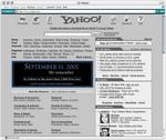
 Several sites across the ‘net are altering their front pages as a tribute to the 9-11 attacks. Some aren’t bad, some seem to be pretty ridiculous (to me, at least).
Of the ones I’ve seen so far, Yahoo‘s seems the silliest. Essentially the same old Yahoo! as ever — just all in greyscale. I kind of prefer the approach that other sites have taken (such as Excite, who set their main page to a simple black background, a rememberance message, and links to enter the content area). This just gives me the feeling that while Yahoo figured they had to do something, they sure as heck weren’t going to hide their content — why, some poor soul might actually get distracted by thinking about actual issues and miss out on some ads!
Then again, maybe I’m just too cynical.
(via MeFi)
