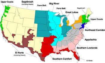
Commonwealth Magazine, unsatisfied with the standard blue (Democrat) vs. Red (Republican) political reporting of elections past, has proposed an interesting division of the country into ten seperate political regions.
this primary-color collage resonates only because it turns up the contrast. Given that more than 40 percent of voters in the blue states backed Bush and more than 40 percent of voters in the red states backed Gore, doesn’t the red vs. blue model seem, well, a bit black-and-white?
So CommonWealth decided to make a map of our own. Aiming somewhere between the reductionist red-and-blue model and the most accurate (but least useful) subdivision of the United States into infinity, we split the county into 10 regions, each with a distinct political character. Our regions are based on voting returns from both national and state elections, demographic data from the US Census, and certain geographic features such as mountain ranges and coastlines. Each region represents about one-tenth of the national electorate, casting between 10.4 million and 10.8 million votes in the 2000 presidential election.
By their map, when I moved to Seattle from Anchorage, I moved from the Sagebrush region (more centrist, 57.4% Bush/37.5% Gore/3.7% Nader in 2000) to the Upper Coasts region (more liberal, 57.5% Gore/35.8% Bush/5.6% Nader in 2000). Works for me.
(via Lane)


your answers stink!!!!!!!!!!!!!!!!!! and are also not true!!!!!!!!!!!!!!!!!!!!!!!!!!!!!!!!
And so’s your old man (who, by the bye, is me)!
One can hardly argue with such penetrating logic!