This entry was published at least two years ago (originally posted on August 18, 2005). Since that time the information may have become outdated or my beliefs may have changed (in general, assume a more open and liberal current viewpoint). A fuller disclaimer is available.
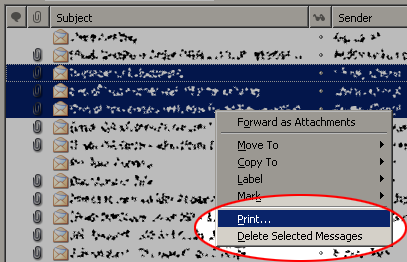
I’m honestly not entirely sure if I should be grumbling at Mozilla’s authors or Windows’ authors, but this drives me up the wall:

Those last two options are way too close together. If the only places for them to go are the last two items on the contextual menu, could there at least be a seperating line between them? I’m just glad Control-Z works after delete operations, or I’d be in a world of hurt, far more often than I’d like to admit.
(Admittedly, this is somewhat compounded with my having to use a mouse on the work computer instead of the tablet that I use at home, which is far easier, more comfortable, and accurate…but I still think this is a bad thing.)

That’s definitely a Mozilla issue – its ridiculously easy to add in separators into the menu; in fact, they’ve already added 2 into that menu already! Why they would put print and delete right next to each other is beyond me.
I rarely use the mouse for stuff outside or the web browser but yeah that is bad menu placement.
CTRL-P :)
I have a similar gripe with Firefox – it has “Save link” and “Send link” next to each other. While that makes sense, I’ve lost count of the times I’ve accidentally clicked “send” instead of “save” and Firefox launched Thunderbird.
I don’t even use a local mail client anymore.
In some older versions of Microsoft Word the quick save and quick print icons were right next to each other. While I was at work I didn’t realize that I had hit print instead of save and when I set down the next day I had a stack of 300 or more pages waiting for me.
Does anyone know why M. Thunderbird would print the record
of a message sent out in green on white as opposed to the
more usual black on white?
As to complaints — When I’ve moved an incoming msg into a
particular folder and then send a reply, why can’t the reply end up in that folder instead of having to be moved there from the ‘sent’ folder?