While I often, and not entirely tongue-in-cheek, spout off that “friends don’t let friends use MySpace,” it’s no secret that I have my own MySpace page and do occasionally (though not often) check in. Mostly, this is because I’ve got a few friends and acquaintances who seem to have been sucked into that particular hell and I have no other reliable way of keeping up with them, but be that as it may, I’m no stranger.
Some time ago, Facebook opened their doors to the general public, and while I signed up for an account a few months ago, I just really started playing around with the site over the past few days. I have to admit, while I’m not a huge Social Networking junkie (and don’t plan on becoming one), Facebook is pretty slick — the same basic idea as MySpace or any other social networking site, but done in a way that doesn’t leave me feeling like I’ve just spent a few hours being beaten with an ugly stick…or, given the number of times MySpace throws errors at me, an ugly stick carved by blind, palsied, one-armed, three-fingered hyperactive toddlers.
Yes, that analogy completely fell apart, but I think you get my point.
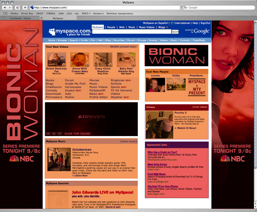
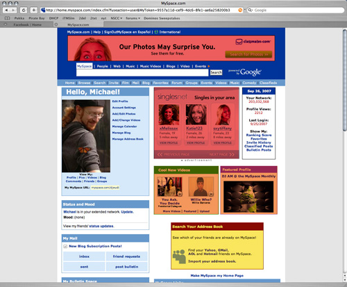
As a quick comparison, here’s a look at the primary pages of the sites that users who are logged in to the system see. Keep in mind, these aren’t the splash pages for the general public — these are for people who’ve already set up an account and are signed in.

I’ve color-coded the screen shot: red highlighted sections are ads for something not directly MySpace related, orange highlighted sections are for items that are (at least arguably) part of the MySpace network. Essentially, the entirety of the first page is advertising — it’s not until you click the tiny ‘home’ link in the menubar (one of three in the header) that you get to your personal page.

Once again, red is for external ads, orange for internal ads, and I’ve used yellow for the “please sucker your friends into joining” box. Around half of the page (or slightly over half, given all the whitespace) devoted to advertising in one form or another.
And this is all just the site default pages — this doesn’t even begin to go into the atrocities that people’s personal profile pages become after they’ve played with every little piece of ‘bling’ that can be added, the horrendous embedded music that far too many people put into their profiles, or the ubiquitous “sorry, we can’t code properly” error messages that pop up as you try to navigate around the site.
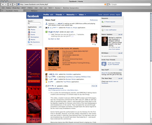
In comparison, here’s how Facebook greets their users:

Sure, there’s advertising — one banner ad on the right for an external service, and one section of the main News Feed showing what events Facebook is tracking that are popular in Seattle. I almost chose a different color for the orange block, as where MySpace’s ads are completely generic, Facebook is at least tying their “look what else we do” advertising to my location. The rest of the page is given to actually showing me information: any waiting friend requests or messages in the sidebar (along with their own “invite your friends” box — the same idea as MySpace’s, but far less intrusive), and the larger central section showing me my friends updates.
Not only is the website itself far better designed, making it drastically easier to navigate (and to put up with), but the extensibility of the Facebook ‘applications’ (small, externally hosted plugins) has allowed me to aggregate nearly all of my various online presences onto my profile page. My weblog posts are automatically copied into Facebook’s ‘notes’, and my LibraryThing ‘reading’ tag, Upcoming events, Flickr photos and Last.fm music tracking are all embedded in the page. All in all, it’s more or less ‘one stop shopping’ for my ‘net presence.
Sure, it’s not perfect — though at the moment, the only annoyances I’ve run into have been with some of the third-party application plugins, rather than with Facebook itself — but as far as social networking goes, this is the first I’ve seen that I’m actually fairly impressed by.

Good analysis all around, Michael!
There are people that I would never have found without MySpace, and to this day, I must occasionally wade back in in order to establish contact with a long-lost pal. Here’s what I do to make it less painful.
If you’re a Firefox user, there are three things that you can do to make MySpace much more palatable. One is MySpace-specific, and the other two are for general decluttering.
The MySpace Custom Style Remover Greasemonkey script.
http://userscripts.org/scripts/show/997
Yep. Just what it says. It’s night-and-day better. I’ll never go back.
Flashgot.
https://addons.mozilla.org/en-US/firefox/addon/220
This extension replaces all Flash content with a little ‘Play’ button. You get to decide when to be assailed by motion and sound.
Adblock, of course.
Between these three things, the ADHD-baiting (to which I am particularly susceptible) is dramatically reduced.
Although MySpace becomes much more tolerable with some Greasemonkey userscripts that remove custom styles and all the advertisements …
Whoops. Now why didn’t I see Royce’s comment before posting, I wonder?
The orange block for Facebook really should be a different colour. That’s not a “look what else we do” advertising block, it’s a “Look what else other people in your area find interesting” block. All of those items are groups and events that other people in your network have created, and they aren’t really affiliated with Facebook in any way except that Facebook hosts them.
I agree with you there! I signed up for a myspace before it was “the cool thing to do” and never signed in for well over a year. Only when a friend of mine told me she found a long lost friend of ours on myspace did I start using it more. Pretty much the only reason I use it. I would prefer to keep something like you have BUT my friends wouldn’t keep track and I would STILL need to keep a myspace. GRR. On a positive side though I found people I haven’t seen in over 10 years! I also have a Facebook for the same reasons! That is all for now. My grammar is horrible! You know me, normally much better. I have a husband in the hospital right now, so I have an excuse! Hugs!
Just one problem:
http://primarysources.newsvine.com/_news/2007/08/21/905477-social-networks-dummy-corporations-and-the-many-faces-of-the-cia
Heh…I remember hearing some rumbling about this sometime last year. Gotta admit, I can’t really drum up a lot of angst about a “rather troubling possibility” that’s little more than “yet-to-be-proven ‘internet rumor'”. I think the article’s summation of this as “enough smoke for an internet conspiracy theory fire” to be pretty precise.