Printing often seems to be the bane of web publishing doesn’t it? All this information scattered across the ‘net, and so many times, trying to get a decent hardcopy printout just results in frustration. Sites that are beautiful in a browser may fail when printed — text disappears into background colors if you’re printing black and white, ads take up tons of unnecessary space on the printed page, and if the site uses tables or a fixed-width CSS layout that’s wider than the page, you may end up with having text cut off along one side of the page. Many commercial sites create special ‘print friendly’ pages, but that’s something of a kludge in itself — it’s an extra click, sometimes the link to the ‘print-friendly’ page is difficult to see, and it means having to deal with that many extra pages (and extra bandwidth) to maintain and serve.
Thankfully, CSS allows a remarkably simple way to avoid having to deal with all these frustrations. With a little bit of coding time, you can create a special “print stylesheet” that will determine exactly how your page looks when it’s printed out, without ever having to deal with the problems outlined above. Here at TypePad, you’ll need to be a “Pro” user to take advantage of this (as you’ll need access to the code of your templates), but the same technique will also work for MovableType powered sites, or any other website where you have full access to your code.
Need a quick example? Just try printing this post out, then compare what your printer gives you to the screen version (Netscape, Mozilla, Firebird, and Safari users will get an extra bonus trick that IE doesn’t support). For all the gory details (which really aren’t all that gory), just read on…
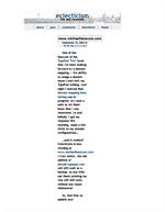
For a quick example, I’ll hold myself up to the spotlight (hey, if I’ve going to point out the problems, might as well humiliate myself instead of someone else, right?). The image to the right shows the result of printing this site after my redesign — those nice big white borders that work so well on screen cause definite issues on the printed page, squishing all the actual content into a single really tiny column in the middle of the page. This obviously was not acceptable! So, I got to work.
The first step was to design the print stylesheet itself. The basics of that are essentially the same as designing an on-screen stylesheet, and you can even use a browser to work it all out. I started by copying my stylesheet into a blank text document on my computer and tweaking it piece by piece to adjust it for the printed page. I won’t go through all the changes I made (though you’re welcome to compare the two to see for yourself — feel free to look at the code for either my screen stylesheet or my print stylesheet), but I do want to call attention to a few of the methods I used.
First off, the borders — an easy fix there, all I had to do was adjust the margins for the #content div from 150 pixels to 5%. By using a percentage instead of a fixed value, it ensures that the content area of the printed page will always be 90 percent of the available width, no matter if the person printing the page is in the US or in Europe (as there are different standard paper sizes).
Now for a handier trick. One of the major differences between on-screen display and the printed page are that navigation elements, such as the navigation sidebar across the top of each page on my site, are essentially useless when printed. Obviously, they can’t be clicked, so all they really end up doing is taking up space on the printed page. If that’s the case, then why bother printing them at all?
In my original stylesheet, my navigation bar is contained within a div of its own, like so:
#navigation {
   text-align: center;
   margin-top: 2px;
   padding: 4px;
   background-color: #eee;
   }
So, for the print stylesheet, I simply changed all of that to this simple argument:
#navigation {
   display: none;
   }
And voila! When printed, that entire div just disappears from the page. That little display: none; argument comes in very handy for deciding just what appears and doesn’t appear on your printed page and on screen. I added a class called “screenonly” to my print stylesheet that uses the display: none; argument, and then wrapped the comment entry form on my individual entry pages in a div class="screenonly" tag — bingo, no printed comment entry form. With a little experimentation, it’s very easy to determine exactly what elements on your pages will and won’t print.
The same technique can be used on screen, of course. I added another class to my screen stylesheet called “printonly” that also uses the display: none; property, then added a copyright declaration to the bottom of every page that is wrapped in a div class="printonly". Now that won’t display onscreen, but will appear when printed. Pretty nifty, isn’t it?
There’s one last trick I want to call attention to before I close out, though — while it will only work in browsers that have good CSS support (in other words, almost every browser except Internet Explorer), it’s incredibly useful.
Links are somewhat of a quandry on the printed page — in fact, by default, they’re nearly useless. A slight color change in the text, but nothing else. However, CSS includes ways to work around this, as well. I added the following lines to my print stylesheet:
.postbody a:link:after, .postbody a:visited:after {
   content: " (" attr(href) ") ";
   }
This looks a little complex, but it’s really not all that scary. The first line says simply that within any element that has the class postbody (I’ve wrapped the text of my posts, trackback excerpts, and comments in divs with that class), any a element that is either a link or a link that has been visited is going to have some information added after that element.
The second line is the content that we’re adding: first we add a space and an opening parenthesis, then we add the href attribute (in other words, the URL that the link points to), then we add a closing parenthesis and another space. That’s it — the last line is simply closing the CSS argument.
So what does all that mean? Simply this — when the page is printed, every link will be followed with the target URL of that link in parenthesis. Nifty!
Okay, so those are some of the tricks I’ve used. Now, supposing you’ve done some poking, prodding, and experimentation on your own and you’ve got a print stylesheet all set up and ready to go — how do you get it working? Easy enough! First off, create a new Index Template for your site, name it something like “Stylesheet-print”, and have it output to “print.css”. Now, you’ll need to do a slight edit to each of your templates.
The default line in TypePad templates that calls the stylesheet is in the header information at the top, and looks like this:
<link rel="stylesheet" href="<$MTBlogURL$>styles.css" type="text/css" />
We’ll be adding one argument to that line, and then adding a second, very similar line –here’s what you should end up with:
<link rel="stylesheet" media="screen" href="<$MTBlogURL$>styles.css type="text/css" />
<link rel="stylesheet" media="print" href="<$MTBlogURL$>print.css" type="text/css" />
What we’ve just done is tell the browser that the “styles.css” file should only apply to on-screen display, while the “print.css” file should apply to content that is sent to the printer. That’s it — rebuild, and you’re done!
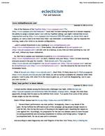
And here we have the final result — the image to the left is how my site prints out with the print stylesheet added. The useless navigation bar has disappeared, borders have been set to values that are far more manageable and readable for the printed page, I’ve brought the font size down a touch, and all links now display their target after the link itself. All in all, a far more readable printed page than what I started with, and all accomplished with a little bit of playing with CSS.
So that’s it! Hopefully this all made sense and is useful for you. As always, feel free to leave any comments or questions below, and I’ll do my best to clarify any places where I may have been unclear. Enjoy!
(Post-link URL display code was found at A List Apart.)