

Catching Beads

All without spilling her beer.
The Learning Process
As I work my way through my Solstice Parade shots, I find I have to keep reminding myself that it’s all part of the learning process — because I’m seriously second guessing a lot of what I did. It’s not that the shots are bad, really…just that they’re not as good as I had hoped (and don’t even compare to some of what I’m seeing from other people).
If I’d stood on the other side of the street I wouldn’t have been shooting into the sun, and I’d be using its light instead of fighting it and backlighting everything. Or, if I’d at least used my flash to fill in the shadows, then I wouldn’t have to be blowing out the sky to make the subjects visible.
If I’d set my aperture to the f/2.8 that the lens I was using would do, then I’d have more depth of field separation between the subjects and the backgrounds, and the photos wouldn’t be so ‘busy,’ distracting from the subject.
sigh
Ah, well. On the bright side, at least I am seeing these things (if after the fact), so I’ll know better next time.
All part of the learning process.
Fremont Summer Solstice Parade

I’m in the process of going through my photos from this year’s Solstice Parade — everything’s imported, named, and tagged, but I still need to decide which ones get fine-tuned and uploaded.
In the meantime, while there’s a few thousand photos up already (and it’s increasing by the hour) either floating around loose or in the group pool, this set from ChrisB really deserves to be seen. A high vantage point and a tilt-shift lens make for a look at the parade that’s very different from everyone else’s shots!
Ladybug
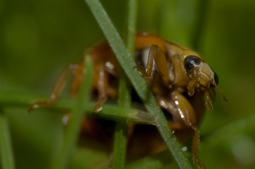
Not quite as cute when seen this close up, are they?
Saw this lil’ guy crawling around in the grass at school the other day and wanted to see what I could get. Shot with my 24mm f/2.8 Nikkor reverse-mounted with a reversing ring, somewhere around f/16 or so, 1/8th of a second, handheld, with the onboard popup flash. At full size, you can see the hairs on the ladybug’s legs!
So. Incredibly. Cool. Here’s some more shots.
Summertime!
A number of updates this evening…
- It’s summertime! I had my last final exam today (yesterday was the Chem 101 exam, I e-mailed my Philosophy 100 final paper in this morning, and had my Programming 142 exam this afternoon). No summer classes for me, so it’s time to relax. Yay!
- I actually really enjoyed this quarter. I was a little unsure about the lineup at first, but it ended up working well, and I had very enjoyable teachers. All in all, I’m pretty solidly sure of getting all A’s again this quarter (knock on wood). We’ll see for sure in a couple weeks.
- The relaxing doesn’t actually begin for a couple days, of course (isn’t this always the way?). Prairie will be at graduation activities for her students most of tomorrow, and I’ve got to work in the afternoon/evening. On Saturday we’ll be going to the Fremont Solstice Parade (I was bummed that I missed it last year, and have been looking forward to this year’s for a while), doing our best to exhaust ourselves, and crash out early, because…
-
…early Sunday morning I drive Prairie out to the airport for a four-day trip with my mom and my sister-in-law Emily. Mom decided a while ago to have a “WHPUWHM” trip — that is, “Women Who Put Up With Hanscom Men,” (those brave and stalwart women who actually choose to associate themselves with the Hanscom family), and the weekend has come. My aunt Pam wasn’t able to join, unfortunately, but Mom, Prairie, and Emily will be spending four days on their own, commiserating with each other about all the things they have to put up with. ;)
- This does mean that I’m on my own, bachelor-style, for four days, from Sunday morning through Wednesday evening. Even better, I have a three-day weekend from work, with Saturday through Monday off. Now, the chances are extremely good that I’ll merely end up spending far too many hours in front of my computer, but with any luck, I’ll be able to get some amount of socializing in. (Is the Mercury doing anything on Sunday nights these days? Preferably something that doesn’t need a membership?)
- We got a new toy! We’d been batting around the idea of getting a laptop computer for a while now for the two of us to share, as with my continuing on through school and our tendency to travel whenever possible necessitating a portable dumping ground for photos when we’re on the run…and Prairie decided that today was the day to take the plunge. Admittedly, there is definitely going to be a ‘period of adjustment,’ as our finances limited us to a price tag in the $600 realm…which meant no Macbook for us, as Apple doesn’t really have a low-end laptop. No, instead, we’re now the somewhat bemused owners of a Gateway MT6705 Notebook PC (oooh, now how’s that for snappy, in-your-face, can’t-forget-it branding!).
- Getting the computer was a minor pain. Neither Best Buy nor Staples came anywhere close to impressing us with their customer service, but there was a very kind young man at Office Depot who ended up helping us narrow things down.
-
The computer itself seems to be quite nice, though I’m not exactly sold on Vista just yet. While it’s all very nice and shiny, I had rather ridiculous issues getting it hooked into our home network…and to top it off, the Gateway tech support person, while very nice, was clueless (to the point of not knowing what “Static IP” was). I eventually figured it out, and after spending some time setting up user accounts for Prairie and I, and spending some more time removing some of the useless adware that comes pre-installed, I’m now puttering away on the new toy while Prairie putters away on her iMac.
- I have a bad feeling my G5 is going to be jealous when I get back to it….
- Lastly, as long as we were setting various bits and pieces up on the new laptop and figuring out how to pull photos from Prairie’s little camera on to it, we also spent some time setting my girl up with her own Flickr account and her own weblog (titled ‘Domesticism’ — a fitting and amusing complement to my ‘Eclecticism’), two things she’d been considering for some time and finally decided to get started on. She’s started off with the story of our quest for our new ‘puter…stop by and say hi!
And…yeah, I think that that pretty much covers it.
THE Final Exam
(I have no idea where this originally came from, I’ve had it bouncing around my hard drive for years. Given that I’m midway through finals week, though, it seemed appropriate…)
Instructions: Read each question carefully. Answer all questions. Time limit: 4 hours. Begin immediately.
HISTORY: Describe the history of the papacy from its origins to the present day, concentrating especially but not exclusively, on its social, political, economic, religious, and philosophical impact on Europe, Asia, America, and Africa. Be brief, concise, and specific.
MEDICINE: You have been provided with a razor blade, a piece of gauze, and a bottle of Scotch. Remove your appendix. Do not suture until your work has been inspected. You have fifteen minutes.
PUBLIC SPEAKING: 2,500 riot-crazed aborigines are storming the classroom. Calm them. You may use any ancient language except Latin or Greek.
BIOLOGY: Create life. Estimate the differences in subsequent human culture if this form of life had developed 500 million years earlier, with special attention to its probable effect on the English parliamentary system. Prove your thesis.
MUSIC: Write a piano concerto. Orchestrate and perform it with flute and drum. You will find a piano under your seat.
PSYCHOLOGY: Based on your knowledge of their works, evaluate the emotional stability, degree of adjustment, and repressed frustrations of each of the following: Alexander of Aphrodiseas, Ramses II, Gregory of Nicea, Hammurabi. Support your evaluation with quotations from each man’s work, making appropriate references. It is not necessary to translate.
SOCIOLOGY: Estimate the sociological problems which might accompany the end of the world. Construct an experiment to test your theory.
MANAGEMENT SCIENCE: Define Management. Define Science. How do they relate? Why? Create a generalized algorithm to optimize all managerial decisions. Assuming an 1130 CPU supporting 50 terminals, each terminal to activate your algorithm; design the communications interface and all necessary control programs.
ENGINEERING: The disassembled parts of a high-powered rifle have been placed in a box on your desk. You will also find an instruction manual, printed in Swahili. In ten minutes a hungry Bengal tiger will be admitted to the room. Take whatever action you feel appropriate. Be prepared to justify your decision.
ECONOMICS: Develop a realistic plan for refinancing the national debt. Trace the possible effects of your plan in the following areas: Cubism, the Donatist controversy, the wave theory of light. Outline a method for preventing these effects. Criticize this method from all possible points of view. Point out the deficiencies in your point of view, as demonstrated in your answer to the last question.
POLITICAL SCIENCE: There is a red telephone on the desk beside you. Start World War III. Report at length on its socio-political effects, if any.
EPISTEMOLOGY: Take a position for or against truth. Prove the validity of your position.
PHYSICS: Explain the nature of matter. Include in your answer an evaluation of the impact of development of mathematics on science.
PHILOSOPHY: Sketch the development of human thought; estimate its significance. Compare with the development of any other kind of thought.
GENERAL KNOWLEDGE: Describe in detail. Be objective and specific.
EXTRA CREDIT: Define the Universe; give three examples.
Frahnk-en-steeeen!
In the vein of “The Producers” (the recent film version — y’know, the film version of the musical stage version of the original film — had Prairie and me practically in tears of laughter when we watched it, and quickly gained a permanent spot in our movie collection), Mel Brooks’ Young Frankenstein is being turned into a stage musical (no word…yet…on the eventual film version of the musical stage version of the original film).
As is becoming something of a trend (one that I happen to be quite fond of), the show is premiering here in Seattle before opening on Broadway.
And Prairie and I have tickets for August 7 — opening night.
Nosebleed section, of course — Mezzanine 31, Row V, sets 7 and 8, virtually the very top rear right of the building — but opening night tickets none the less. We’re quite excited about this.
“Wasn’t your hump on the other side?”
(pause)
“What hump?”
Inappropriate Thoughts

Slightly tangentially related:
I once knew someone (in fact, I still know him, though I hesitate to identify him for fear of recrimination — or, perhaps, incrimination) who told me that, upon meeting the new husband of an ex-girlfriend of his, had to suppress the urge to say, “I took your wife’s virginity.”
Wrong. Rude.
And — in my world — very funny.
Steam Trek
(via TrekMovie.com)