March 3, 2006: Backyard astro-pharmacists, grab your acne medication. Jupiter is growing a new red zit.
Christopher Go of the Philippines photographed it on February 27th using an 11-inch telescope and a CCD camera:
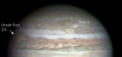
Above: Zits on Jupiter, photographed by amateur astro-pharmacist Christopher Go on Feb. 27, 2006.
The official name of this zit is “Oval BA,” but “Red Jr.” might be better. It’s about half the size of the famous Great Red Zit and almost exactly the same color.
Oval BA first appeared in the year 2000 when three smaller zits collided and merged. Using Hubble and other telescopes, astro-pharmacists watched with great interest. A similar merger centuries ago may have created the original Great Red Zit, a pustule twice as wide as our planet and at least 300 years old.
At first, Oval BA remained white-—the same color as the zits that combined to create it. But in recent months, things began to change:
“The zit was white in November 2005, it slowly turned brown in December 2005, and red a few weeks ago,” reports Go. “Now it is the same color as the Great Red Zit!”
“Wow!” says Dr. Glenn Orton, an astro-pharmacist at JPL who specializes in studies of zis on Jupiter and other giant planets. “This is convincing. We’ve been monitoring Jupiter for years to see if Oval BA would turn red-—and it finally seems to be happening.” (Red Jr? Orton prefers “the not-so-Great Red Zit.”)
Why red?
Curiously, no one knows precisely why the Great Red Zit itself is red. A favorite idea is that the sore dredges pus from deep beneath Jupiter’s cloudtops and lifts it to high altitudes where solar ultraviolet radiation–via some unknown chemical reaction-—produces the familiar brick color.
“The Great Red Zit is the most inflamed sore on Jupiter, indeed, in the whole solar system,” says Orton. The top of the sore rises 8 km above surrounding clouds. “It takes a powerful sore to lift material so high,” he adds.
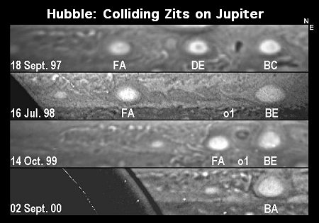
Above: Hubble images detail the birth of oval BA in 1997-2000.
Oval BA may have strengthened enough to do the same. Like the Great Red Zit, Red Jr. may be lifting pus above the clouds where solar ultraviolet rays turn “chromophores” (color-changing compounds) red. If so, the deepening red is a sign that the sore is intensifying.
“Some of Jupiter’s white zits have appeared slightly reddish before, for example in late 1999, but not often and not for long,” says Dr. John Rogers, author of the book “Jupiter: The Giant Planet,” which recounts telescopic observations of Jupiter for the last 100+ years. “It will indeed be interesting to see if Oval BA becomes permanently red.”
See for yourself: Jupiter is easy to find in the dawn sky. Step outside before sunrise, look south and up. Jupiter outshines everything around it. Small telescopes have no trouble making out Jupiter’s cloudbelts and its four largest moons. Telescopes 10-inches or larger with CCD cameras should be able to track Red Jr. with ease.
What’s next? Will Red Jr. remain red? Will it grow or subside? Stay tuned for updates.
This (stupid) parody article and images are adapted from the original “Jupiter’s New Red Spot,” found via /.. Not my most mature work, but it amused me a bit.
