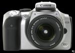
Now that my new computer is on the way (two weeks to go, at most…), I’ve started fixating on a new item for my techno-lust: the Canon EOS Digital Rebel.
I’ve had an interest in photography for many years now. I remember playing with my dad’s old SLR camera when I was younger — unfortunately, it didn’t work anymore, but I had fun fiddling around with it. I took one quarter of photography in high school. Not so much that I really remember much of anything, but enough to cement it as a definite interest. However, it’s been a fairly low-level interest for many years.
Just before I left Anchorage I picked up a nice little Kodak digital camera (the DX3500) which has served me well over the past few years. I’ve even managed to come up with a few shots that I really like from time to time (my favorite so far being one of Post Alley here in Seattle). The more I play with it, though, the more I wish I had a more full-featured camera, and the Canon EOS looks to be a really good value.
It’s essentially a full-featured SLR digital camera. 6.1 Megapixel resolution (roughly three times the resolution of my current camera), through-the-lens viewfinder, the ability to accept all of Canon’s EF series lenses and Speedlite flashes, and all sorts of other goodies. It even got rated ‘Highly Recommended’ by DPReview.
The downside, of course, is that I won’t be able to afford it anytime soon. While the \$999 price is extremely good for everything you get with the camera, it’s definitely out of my price range anytime in the near future (especially if I ever want to get myself out of debt). Ah, well — such is the way of life, right? At the very least, it’s a goal for the future.
Of course, if anyone out there is feeling generous at all, you’re welcome to help me out here! ;)
PayPal donations are accepted, if you go shopping at Amazon through this link I’ll get a miniscule percentage of whatever you spend, and, of course, Christmas is only a few short months away. Okay, sure, I’m shameless. But as I’m not expecting anyone to actually chip in, I can’t exactly be disappointed, now can I?