iA Presenter and Headings

I’m quite curious about iA Presenter (a new Markdown-focused presentation creation app), so I downloaded the 14-day trial.

And it is immediately driving me up the wall that in the sample/instructional presentation that loads by default, the creators are repeatedly misusing headings to create the style for their demonstration slides.
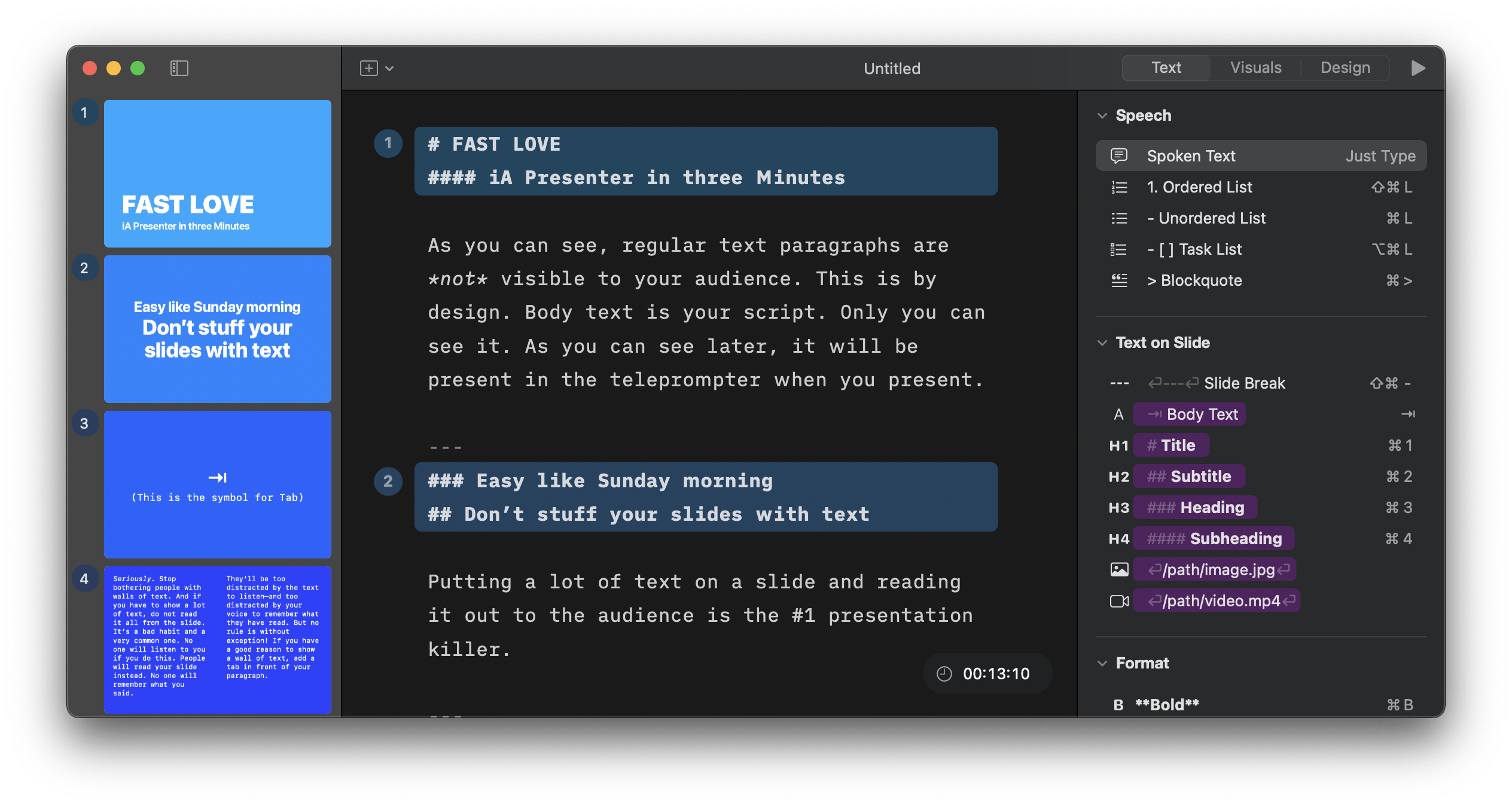
The iA Presenter window as first opened to the demo presentation. The Markdown code for the content begins with an H1 followed by an H4. The next slide begins with an H3 that is followed by an H2.

The cover slide starts with an H1 and then immediately jumps to an H4, presumably because they wanted the visual distinction between the larger text of the title and the notably smaller text of what’s being used as a subtitle. But that skips two levels of headings.

The second slide (and many other slides) starts with an H3 that is immediately followed by an H2. Consistently, slide after slide, it’s an H3 followed by an H2. Again, this appears to be done for the visual presentation, as it results in the smaller-text headline over the larger-text headline. But that means that the headings are all out of order and don’t create a consistent outline to indicate the structure of the document.

And this sort of thing continues throughout the entire demo presentation.

Not only is this generally sloppy, but it’s an accessibility issue: When headings are skipped, users of assistive technology like screen readers have to try to figure out from context whether the headings have actually been skipped, or if they’re they exist but haven’t been tagged properly, or if they’re being presented out of order. When the document outline is out of order, it makes it much more difficult to navigate through and build a coherent mental picture of the final document.

I haven’t gotten as far as looking to see how iA Presenter does with its output (Is the HTML it generates standards compliant? Are the PDFs it generates properly tagged for accessibility)? But even if it exported perfect HTML or ideally tagged PDFs, the content will have accessibility issues because the designers are prioritizing style over substance. And with this as their demo, many people using the app will likely follow their lead.

And that’s a shame. Because on first blush, it’s a gorgeous app with some extremely good advice on how to conceptualize and plan better presentations and some great templates. All criticisms aside, I’m still looking forward to experimenting with it. But the abuse of headings and lack of concern for reasonable document structure is not giving a very good first impression.

Read more

In Search of a MarsEdit Equivalent for iOS

A question for macOS WordPress bloggers who use Red Sweater Software’s excellent MarsEdit: What’s your go-to mobile iOS blogging tool?

MarsEdit is a great example of a “do one thing and do it really well” piece of software, and I’ve yet to find anything equivalent for mobile blogging. I just want exactly what MarsEdit gives me: A list of my most recent posts and pages, a solid plain-text Markdown editor, and access to all the standard WordPress fields and features.

Every other editor I’ve tried either doesn’t do one or more of those things or is otherwise not quite right in some way. Ulysses was the closest and I tried it for a while, but while it’s a great editor, it doesn’t pull a list of posts and pages from the blog, just works with whatever’s local or in its own cloud sync or Dropbox or whatever, and last time I used it, had a bug where alt text wasn’t getting applied to images correctly.

(The WordPress native app drives me up the wall. I don’t want block editing. I want text and Markdown.)

Really, what I want is an iOS version of MarsEdit. But failing that: any recommendations?

Website (not blogging) Ennui

I’m not really happy with my website — I’m tired of WordPress, and ‘view source’ just makes me cringe at all the junk, cruft, and JavaScript bogging down what could and should be relatively simple, clean, HTML/CSS — but I don’t know how to reinvigorate it in a way I like.

I don’t want to entirely stop blogging, nor do I want to lose all the stuff that’s here already, or break existing URLs.

I’ve been looking into various flat-file or static CMS backends, and though grav is the one that most caught my eye, it (as far as I can tell) would mean losing the ability to post through micro.blog or any other third-party app that uses the MetaWeblog API, which would make spur-of-the-moment posts more difficult.

Even if I did resign myself to only adding posts through the admin UI (or by FTPing in to manually build the folder/file structure that grav uses), if I figured out how to import all my past entries from WordPress (this might do it), I haven’t been able to find a way to tweak the URL structure, which means I’d probably have to figure out how to generate a huge .htaccess file to handle the 5,170 or so redirects so I didn’t break any existing URLs. I may not get linked to a lot, but it happens occasionally, and I’d prefer not to 404 those.

(Plus, as I was playing with grav, I kept getting blank screens where I should have been getting post entry or edit screens, which…well, not sure if that’s a grav issue, a Safari browser issue, or some other issue, but it didn’t bode well.)

Other backends either looked too complex for my current needs/skills/available time (I just don’t have the time or impetus to try to learn Jekyll, which kept popping up), or didn’t fully support Markdown at all or enough, or had one or another thing that made them feel “not right” for me.

Really, what I’d kind of like to do is go back to hand-coding my site, so I have full control over the HTML/CSS (even if it looks like crap, it’ll look like my crap…so to speak), only to still be able to blog easily using micro.blog or Ulysses or other such tools. Not sure that’s really a possibility, though.

In the end, this isn’t much more than a bit of whinging and trying to figure out what exactly I’m looking for. But if anyone actually 1) reads this, and 2) has a magical solution for all my woes, I’d be happy to hear it!

Markdown is the new Word 5.1

From Markdown is the new Word 5.1:

There’s a way out of this loop of bouncing between cluttered word processors and process-centric writing tools, a way to avoid having cater to Clippy’s every whim while not having to hide your own work from yourself in order to concentrate. People have been saying for years that Word 5.1 needs to be ported to Mac OS X; that having that program running on current hardware would be the ideal solution to all of these problems with writing tools.

The truth is, there’s a solution now that’s most of the way there: Markdown and a good text editor. That’s the new Word 5.1. Think about it: a program like TextMate (I use TextWrangler. –mh) has almost no window chrome, and opens almost instantly. You start typing, and that’s all you have to do. I bring up Gruber because he invented Markdown, which lets you do basic formatting of text without really having to sweat much else. The types of formatting you don’t need aren’t even available to you when writing Markdown in a text editor, so you never have to deal with them.

Markdown will never be unreadable by a program, because it’s just ASCII text. It’s formatted, but if you’re reading the raw text, it’s not obscured the way a raw HTML file is. Any decent editor will give you a word count and can use headings as section and chapter breaks. With MultiMarkdown the options get even crazier: render your text file as a LaTeX document, or straight to PDF, or any number of other things. All from a text file and an editor with a minimal interface.

Almost all of my writing for many, many years now has been in a text editor using Markdown-formatted text. I’m using Markdown formatting for this blog post (which WordPress then automatically translates into HTML), I’ve written many, many discussion board posts for school in Markdown format before pasting them into BlackBoard, and I use Markdown formatting whenever I’m writing email messages.

I’m in that set of people who fondly remember Word 5.1, and miss the days of having a word processor that was actually a word processor, not an overblown attempt to do absolutely everything ever related to desktop publishing all at once (even Apple’s Pages, while far preferable to any post-5.1 version of Word, is far more than just a simple word processor). My senior year of high school, I booted my Mac Classic into Mac OS 6 with one 1.44 MB floppy; another 1.44 MB floppy held Word 5.1 and every paper I wrote that year.

Those days will never come again, admittedly. But a simple text editor and Markdown formatting is all that’s really needed.