Affinity by Canva Accessible PDF Output Test

The Affinity by Canva splash screen over an Adobe Acrobat window with an open PDF document.

With the release of Affinity by Canva, I was curious how they were doing on supporting creating accessible PDF output. A very quick cursory initial check showed some hopeful signs, but I wanted to take a more detailed look, so I’ve put together a brief test document to check some of the more common document features. This isn’t at all meant to be all-encompassing and comprehensive; it’s just what popped to mind as I was experimenting. My hope is to occasionally update this as I think of more test cases (or have more test cases suggested to me) and as Affinity is updated.

More details are in the document itself, but in brief, I set up several test cases using various Affinity features, exported to tagged PDF, and checked the PDF in Acrobat to see how things looked.

If you’d like to play along at home, you can download the source .af document (5 MB .zip) and the exported .pdf document (721 KB .pdf) to review yourself and otherwise do with as you wish under a Creative Commons BY 4.0 license.

The executive summary TL;DR: Canva/Affinity is making improvements, but Affinity in its current state is definitely not ready to be a replacement for Adobe InDesign. If you’re an Affinity die-hard and have the time and resources to do remediation work in Acrobat Pro or using a tool like CommonLook, you could certainly go that route, but don’t expect to be able to export an accessible PDF from Affinity just yet.

I do want to be clear that none of this is to say that Affinity is “bad” or shouldn’t be used; on the contrary, I’m looking forward to using it as much as I can (for experimentation and any print-only work I do). This is all intended to encourage Canva/Affinity to continue working on this aspect of their software.

Test Case 1: Paragraphs

Result: Fail. Any paragraph that is more than one line gets one P tag for every line, rather than one P tag for the entire paragraph. In addition, if there are any deviations from the base style (using character styles, manual formatting, adding hyperlinks, etc.), all of those end up in their own individual P tags instead of being wrapped in Span tags inside the P tag.

Test Case 2: Headings

Result: Pass (with qualifications). When creating styles, PDF (and EPUB) export tagging can be assigned — as long as you only need P or H1 through H6; no other tags (like BlockQuote, for example) can be assigned to styles. Within that, though, text given a heading style does export with the correct tag…but once again, if the heading spans more than one line, it ends up being two H1 (or whatever level) tags rather than one.
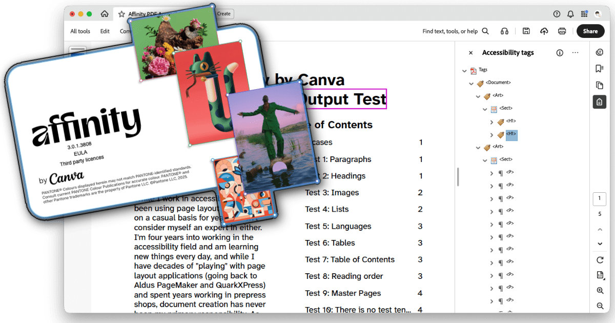
Test Case 3: Images

Result: Pass/Fail (yes, both).

Pass: Images can be placed inline or floated; if floated, they can be anchored within text. Alt text can be assigned various ways, either manually or (in theory, I didn’t test this) automatically pulled from the image’s XMP metadata. The alt text pane also supports adding extended description and summary text, though I haven’t played with these fields yet. Alt text is correctly added to the Figure tag in the PDF.

Fail: Though the images were placed inline with the text in the document, the Figure tag was placed at the end of the content for its parent text frame rather than at the proper place within the text.

Test Case 4: Lists

Result: Fail. Lists are tagged as paragraphs, without any L or child LI, LBL, or LBODY tags.

Test Case 5: Languages

Result: Fail. I could not find any way to designate a base language for the document as a whole. Character and paragraph styles can be given a language setting, but (in addition to the character style being tagged as a new P rather than a Span within the paragraph) the language is not set in the tag properties.

Test Case 6: Tables

Result: Fail. Simple tables can be added and their visual presentation can be adjusted, but I found no way to set header rows or columns. Tables also cannot be given alt text (at least, not with the same Tags pane used to add alt text to images).

The table was not tagged with any Table or child TR, TH, or TD tags, just a lot of P tags. In addition, though the table was inline with text later in the document, it was placed as a Sect at nearly the top of the document, the first tags underneath the opening H1 tags.

Test Case 7: Table of Contents

Result: Fail. Affinity can automatically generate a table of contents from the header styles used in a document. However, the exported PDF does not use any TOC or associated child tags; every line of the table of contents is a P tag followed by a Link tag that contains two Link - OBJR tags, one for the text of the item and one for the page number.

Test Case 8: Reading Order

Result: Pass (with qualifications). Affinity has a Reading Order panel which allows you to rearrange items, group items together into articles, and toggle items off and on, and this does properly affect the tags in the exported PDF. In an earlier test document (not publicly distributable), I was easily able to put all of the objects in their correct reading order. However, in this test document, the images (which are placed inline with the text, and therefore within a text frame) don’t appear in the reading order panel, and as noted above, don’t have their Figure tags placed in the correct location.

Test Case 9: Master Pages

Result: Pass. My test document had master pages set up with footer text; this text was properly excluded (artifacted) in the PDF.

Test Case 10: There is no test ten…

…because I ran out of ideas right then. But more can be added! When I have time, I want to add more objects to play with the reading order pane more, explore Affinity’s footnotes/index/reference support (which at this point I don’t expect to be tagged correctly, but maybe someday), and there are probably plenty of other things that more experienced accessibility and/or document creation professionals might think of.

Conclusion

As noted in the TL;DR up top, Affinity is a long way away from being able to replace InDesign when it comes to creating accessible PDFs.

That said — they’re working on it! This is more support than the last version of Affinity had, and there are more signs here and there that more may be in development. For example, while I was looking for a way to specify a base document language, I checked the File > Document Metadata option, and it’s a series of checkboxes and fields for specifying exactly which accessibility features a document supports, its conformance level, a certifier’s name and credentials, and so on. (The actual basic document metadata, including title, author, copyright info, etc., can be set with the Window > References > Fields pane, and does get properly added to the exported PDF.)

While there’s certainly work to be done, I’m encouraged to see the features that have been added so far, and as noted above, want to encourage Affinity to continue working on this aspect of the app. I would love to be able to finally drop InDesign (as I dropped Photoshop and Illustrator years ago) and move entirely over to Affinity (well…entirely aside from Acrobat…).


Addendum: ePub output

Out of curiosity and a question on Mastodon (that I don’t actually think was directed at me, but that’s okay), I exported this test document to ePub format, using both the “fixed layout” and “reflowable” options. I then checked each file in both Thorium Reader and Apple’s Books app, and ran them through the Ace by DAISY ePub accessibility checker.

It should be noted that I did not change anything about the file for this test, and I created the document with PDF in mind, not ePub, so this may affect the results.

I’m not as experienced in checking ePub files, but a few notes:

Ace by DAISY reported errors with both documents. The fixed layout version had eight errors, three serious and five moderate; the reflowable version had 22 errors, one critical, 16 serious, and five moderate. The ePubs and Ace by DAISY reports may be downloaded for you to review. All downloadable files are .zip files that you’ll need to decompress — I know that ePubs are already zipped, but my WordPress configuration wouldn’t allow me to upload the .epub file.

The fixed layout version is much larger than the reflowable. I think that’s because the reflowable version seems to have scaled and compressed the photos in the document, while the fixed layout version left them at their original sizes. This may have been an export setting in Affinity that I didn’t adjust.

Neither document has bookmarks automatically defined.

The fixed layout version in Thorium using Thorium’s built-in reader reads the images outside of their placement in the text, instead speaking them at the beginning of the second page. The table on page three also gets read at the beginning of the third page. This does not happen with the reflowable version; images are read in their correct locations.

There’s an odd black square graphic that appears at the end of the Test 3 section in the reflowable version that is not present in the original Affinity file. I have no idea where this image is coming from.

Using Apple Books’s built-in reader, the reflowable version seemed to read properly, but the fixed layout version was missing large chunks of text.

With the aforementioned caveat that this document wasn’t created with ePub in mind, which may be affecting things, my first impression is that, as with PDF tagging, Affinity has some work to do with creating accessible ePub files. This is definitely an app that currently is much more aimed at visual presentation (whether print or electronic), with accessibility being an afterthought. Once again, I hope this improves over time as future versions are released.

Initial Thoughts on Affinity by Canva

I’ve been an Affinity Photo/Designer/Publisher user since sometime before 2019 (the first mention I can find here), and have recommended them to a lot of people as a less expensive but (nearly) equivalent alternative to Adobe’s Photoshop/Illustrator/InDesign suite of apps. Last year Affinity was acquired by Canva, which did not thrill me (I’m not a fan of Canva, as accessibility has never seemed to be a high priority for them, and remediating PDFs created by Canva users is an ongoing exercise in frustration), but at the time they pledged to uphold Affinity’s pricing and quality. All we could do at that point was wait to see what happened.

A few weeks ago, Affinity closed their forums, opened a Discord server, removed the ability to purchase the current versions of the Affinity suite of apps, and started posting vague “something big is coming” posts to their social media channels and email lists. Not surprisingly, this did not go over well with much of the existing user base, and we’ve had three weeks of FUD (fear, uncertainty, and doubt), with a lot of people (including me) expecting that Canva would taking Affinity down the road of enshittification.

Yesterday was the big announcement, and…

The Affinity by Canva startup splash screen.

…as it turns out, it looks to me at first blush that it doesn’t suck. The short version:

  1. Affinity Photo, Designer, and Publisher have been deprecated, all replaced with a single unified application called Affinity by Canva.
    1. The existing versions of the old Affinity suite (version 2.6.5) will continue to work, so existing users can continue to use those if they don’t want to update. In theory, these will work indefinitely; in practice, that depends on how long Canva keeps the registration servers active and when Apple releases a macOS update that breaks the apps in some way. Hopefully, neither of those things happens for quite some time (and if Canva ever does decide to retire the registration servers, I’d really hope that they’d at least be kind enough to issue a final update for the apps that removes the registration check; I don’t expect it, but it would be the best possible way to formally “end of life” support for these apps).
  2. Affinity by Canva is free.
    1. You do need to sign in with a Canva account. But you had to sign in to Affinity with Serif account, and Canva now owns Serif, so this isn’t exactly a big surprise for me.
  3. The upsell is that if you want to use AI features, you have to pony up for a paid Canva Pro account. Assumedly, they figure there are enough people on the AI bandwagon that this, in combination with Canva’s coffers, will be enough to subsidize the app for all the people who don’t want or need the AI features.
    1. “AI features” is a little vague, but it seems to cover both generative AI and machine learning tools.

    2. Affinity’s new “Machine Learning Models” preferences section has four optional installs: Segmentation (“allows Photo to create precise, detailed pixel selections”), Depth Estimation (“allows Photo to build a depth map from pixel layers or placed images”), Colorization (“used to restore realistic colors from a black and white pixel layer”), and Super Resolution (“allows pixel layers to be scaled up in size without loss of quality”). Of these, Segmentation is the only one that currently is installable without a Canva Pro account; the other three options are locked. The preferences dialog does have a note that “all machine learning operations in Affinity Photo are performed ‘on-device’ — so no data leaves your device at any time”.

    3. The Canva AI Integrations page on the new Affinity site indicates that available AI tools also include generative features such as automatically expanding the edges of an image and text-to-image generation (interestingly, this includes both pixel and vector objects).

    4. In the FAQs at the bottom of the integrations promo page, Canva says that Affinity content is not used to train AI. “In Affinity, your content is stored locally on your device and we don’t have access to it. If you choose to upload or export content to Canva, you remain in control of whether it can be used to train AI features — you can review and update your privacy preferences any time in your Canva settings.”

      1. If you, like me, are not a fan of generative AI, I do recommend checking your Canva account settings and disabling everything you can (I’ve done this myself). The relevant settings are under “Personal Privacy” (I disabled everything) and “AI Personalization”.
    5. I actually feel like this is an acceptable approach. Since I’m no fan of generative AI, I can simply not sign up for a Canva Pro account, disable the “Canva AI” button in Affinity’s top button bar, and not worry about it; people who do want to use it can pay the money to do so. I do wish there was a clearer distinction between generative AI and on-device machine learning tools and that more of the on-device machine learning tools were available without being locked behind the paywall; that said, the one paywalled feature I’d be most likely to occasionally want to use is the Super Resolution upscaling, and I can do that in an external app on the occasional instances where I need it.

So at this point, I’m feeling mostly okay with the changes. There are still some reservations, of course.

I’m not entirely sold on the “single app” approach. Generally, a “one stop shop” approach tends to mean that a program is okay at doing a lot of things instead of being really good at doing one thing, and it would be a shame if this change meant reduced functionality. That said, Affinity has said that this was their original vision, and they’ve long had an early version of this in their existing apps, with top-bar buttons in each app that would switch you into an embedded “light” version of the other apps for specific tasks, so it does feel like a pretty natural evolution.

A lot of this does depend on how much trust you put in Canva. Of course, that goes with any customer/app/developer relationship. I have my skepticism, but I’m also going to recognize that at least right now, Canva does seem to be holding to the promises that they made when they acquired Serif/Affinity.

Time will tell how well Canva actually holds to their promises of continuing to provide a free illustration, design, and publishing app that’s powerful enough to compete with three of Adobe’s major apps. Right now, I’m landing…maybe not on “cautiously optimistic”, but at least somewhere in “cautiously hopeful”.

Finally, one very promising thing I’ve already found. While I haven’t done any in-depth experimenting yet, I did take a peek at the new Typography section, and styles can now define PDF export tags! The selection of available tags to choose from is currently somewhat limited (just P and H1 through H6), but the option is there. I created a quick sample document, chose the Export: PDF (digital – high quality) option, and there is a “Tagged” option that is enabled by default for this export setting (it’s also enabled by default for the PDF (digital – small size) and PDF (for export) options; the PDF (for print), PDF (press ready), PDF (flatten), PDF/X-1a:2003, PDF/X-3:2003, and PDF/X-4 options all default to having the “Tagged” option disabled).

When I exported the PDF (38 KB PDF) and checked it in Acrobat, the good news is that the heading and paragraph tags exist! The less-good news is that paragraphs that go over multiple lines are tagged with one P tag per line, instead of one P tag per paragraph.

So accessible output support is a bit of a mixed bag right now (only a few tags available, imperfect tagging on export), but it’s at least a good improvement over the prior versions. Here’s the current help page on creating accessible PDFs, and hopefully this is a promising sign of more to come.

Weekly Notes: October 13–19, 2025

  • ♿️ The big thing at work this week was Friday’s annual professional development day; I was serving on the PDD committee, and presented for one of the sessions. The first time I did a PDD accessibility presentation I had two attendees; this year I had over 60, so I’d say that’s a success! If you’d like, you can head on over to YouTube to see me ramble on for a bit over an hour with an introduction to viewing, checking, and editing accessibility tags in PDFs.

  • 🇺🇸 Saturday we took the light rail into Seattle to be part of No Kings 2.0 protest. Reports say that Seattle had around 90,000 participants and that there were as many as 8 million countrywide, making this the second-largest protest in U.S. history (after the 1970 Earth Day protest, which drew 20 million). I brought my camera; my photos from the protest are on Flickr.

  • 🎭 Sunday we went back into the city to see the Seattle Opera’s The Pirates of Penzance. The production was great, and we both really enjoyed getting to see it; I hadn’t seen a performance of Penzance in decades, and it was my wife’s first time seeing a Gilbert and Sullivan operetta on stage. Great way to wrap up a weekend.

📸 Photos

A low-angle shot of a shallow pond on a sunny fall day.
I wrapped up professional development day on Friday with a walk around the pond in the wooded area on campus.
The program for The Pirates of Penzance, held up with the audience and stage in the background.
It is, it is, a glorious thing, to be a pirate king!

📚 Reading

I read the latest Star Trek: Strange New Worlds novel, David Mack’s Ring of Fire.

🎧 Listening

For some time now I’ve been collecting the “Matrix Downloaded” compilations from the Alfa Matrix label. This week I got notification that issue twelve was out, which I realized meant I’d missed the release of issue eleven, so both of those have just been added to my collection. Between professional development day and the weekend’s activities, I haven’t really dug into them yet, but they’re generally pretty solid compilations.

🔗 Linking

Google Docs Adds PDF Accessibility Tagging

I don’t know exactly when this happened (my best guess is maybe sometime in April, based on this YouTube video; if you watch it, be aware that the output seems to have improved since it was made), but at some point in the not-too-distant past, Google Docs has started including accessibility tags in downloaded PDFs. And while not perfect, they don’t suck!

update: Looks like this started rolling out in December 2024, earlier than I realized. Thanks to Curtis Wilcox for pointing out the announcement link.

Quick Background

For PDFs to be compatible with assistive technology and readable by people with various disabilities, including but not at all limited to visually disabled people who use screen readers like VoiceOver, JAWS, NVDA, and ORCA, PDFs must include accessibility tags. These are not visible to most users, but are embedded in the “behind the scenes” document information, and define the various parts of the document. Assistive technology, rather than having to try to interpret the visual presentation of a PDF, is able to read the accessibility tags and use those to voice the document, assist with navigation, and other features.

However, until recently, Google Docs has not included this information when exporting a PDF using the File > Download > PDF Document (.pdf) option. PDFs downloaded from Google Docs, even if designed with accessibility features such as headings, alt text on images, and so on, were exported in an inaccessible format (as if they had been created with a “print to PDF” function). The only way around this was to either use other software to tag the PDF or to export the document as a Microsoft Word .docx file and export to PDF from Word.

But that’s no longer the case! I first realized this a couple months ago when I was sent a PDF generated from Google Docs and was surprised to see tags already there. I’ve recently had the chance to dig into this a little bit more, and I’m rather pleasantly surprised by what I’m seeing. It’s not perfect, but it doesn’t suck.

Important note

I’m not a PDF expert! I’ve been working in the digital accessibility space for a bit over three years now, but I’m learning more stuff all the time, and I’m sure there’s still a lot I don’t know. There are likely other people in this space who could dig into this a lot more comprehensively than I can, and I invite them to do so (heck, that’s part of why I’m making this post). But I’m also not a total neophyte, and given how little information on this change I could find out there, I figured I’d put what knowledge I do have to some use.

Testing process

Very simple, quick-and-dirty: I created a test Google Doc from scratch, making sure to include the basics (headings, descriptive links, images with alt text) and some more advanced bits (horizontal rules, a table, a multi-column section, an equation, a drawing, and a chart). I then downloaded that document as a PDF and dug into the accessibility tags to see what I found. As I reviewed the tags, I updated the document with my findings, and downloaded a new version of the PDF with my findings included (338 KB .pdf).

Acrobat Pro displaying a document titled 'this is an accessibility test document' with the tags pane open to the right and the first line of the document selected and highlighted with a purple box.

Findings

More details are in the PDF, but in brief:

  • Paragraphs are tagged correctly as <P>.
  • Heading are tagged correctly as <H1> (or whatever level is appropriate).
  • Links are tagged correctly as a <Link> with a <Link - OBJR> tag. Link text is wrapped in a <Span>, and the link underline ends up as a non-artifacted <Path>.
  • Images are tagged correctly as a <Figure> with alt text included. However, images on their own lines end up wrapped inside a <P> tag and are followed by a <Span> containing an empty object (likely the carriage return).
  • Lists are pretty good. If a <LI> list item includes a subsidiary list, that list is outside of the <LBody> tag, and I’m not sure if that’s correct, incorrect, or indifferent. Additionally, list markers such as bullets or ordinals are not wrapped in <LBL> tags but are included as part of the <LBody> text object. However, this isn’t unusual (I believe Microsoft Word also does this), and doesn’t seem to cause difficulties.
  • Tables are mostly correct, including tagging the header row cells with <TH> if the header row is pinned (which is the only way I could find to define a header row within Google Docs). However, the column scope is not defined (row scope is moot, as there doesn’t seem to be a way to define row header cells within Google Docs; the table options are fairly limited).
  • Horizontal lines are properly artifacted, but do produce a <P> containing an empty object (presumably the carriage return, just as with images).
  • Using columns didn’t affect the proper paragraph tagging; columned content will be read in the proper order.
  • Inserted drawings and charts are output as images, including any defined alt text.
  • Equations are just output as plain text, without using MathML, and may drop characters or have some symbols rendered as “Path” within the text string. STEM documents will continue to have issues.

Conclusion

So, not perfect…but an impressive change from just a few months ago, and really, the output doesn’t suck! For your basic, everyday document, if you need to distribute it as a PDF instead of some other more accessible native format, PDFs downloaded from Google Does now seem to be a not-horrible option. (My base recommendation is still to distribute native documents whenever possible, as they give the user agency over the presentation, such as being able to adjust font face, size, and color based on their needs. However, since PDFs are so ubiquitous, it’s heartening to see Google improving things.)

Alt Text Tips From A Visually Impaired Person

If you’ve ever struggled with writing alt text for images, especially for photos that seem difficult to describe, here are six excellent tips from a visually impaired person, posted to Mastodon by @hello@makary.online:

  1. Tell me about the colours, because of all the people who need an alt text, some of us see a little bit, or we used to, so we know what colours are. Even those of us who were born blind, we know intellectually what green is and that it’s the colour of grass, and leaves, and people usually bring it up in the context of life, and hope, and so on. Just because you haven’t seen an atom doesn’t mean that the concept is unthinkable for you, right?

  2. I know what shapes and textures are, if you tell me that something is smooth, I know what smooth is, if you tell me that something is made of cloth, I know how that feels, if you tell me it has sharp edges, I know how sharp edges feel and how they are different from soft, rounded corners.

  3. Give me the context. If it is a character from a book or a series, tell me their name and the title, maybe I know them! I listen to audiobooks and series all the time! If it’s a comic and the people interacting are a couple, it is important, and means something else than if they are siblings, or a parent with a child, or an owner and their dog. If someone on the photo makes an awkward or unhappy face, or grins like crazy, that’s information that helps me get it.

  4. Give me vibes. Describe it to me the way you see it. If you think the drawing of a doll is creepy, say ‘it seems creepy to me’. If the picture of a sunrise makes you feel at peace, tell me ‘It looks really peaceful to me’. Tell me how it makes you feel, be evocative, because that’s what experiencing stuff is, you know, experiencing. If you don’t feel sure about it, also tell me. ‘It feels off and eerie for some reason, but I can’t put my finger on it’ is a very interesting description.

  5. Be a person. AI image descriptions not only sometimes get stuff wrong, but also miss all the context. A robot will not know which part of the picture is important. I am not a robot, neither are you. Just think about ‘how would I describe it to a friend who cannot see it for whatever reason’ and do that. You are not my external eyes, because that’s not possible, you are a person describing stuff to me.

  6. Do as much or as little as you can. You don’t have to write an essay about every meme. Write as much or as little as you can, have time and feel comfortable with. If you give a short or a bad description, I can see that, and that’s what happens in life lol. But if you don’t put ANY description. the whole thing that you thought was important enough for you to share, doesn’t exist at all for me and people like me, and that’s just low-key sad.

An Alt Text Experiment

I’m the website administrator for Seattle Worldcon 2025, and I decided to run a bit of an experiment with the site, playing with an idea I’d been toying with for next year’s Norwescon website.

As I’ve been learning more about accessibility over the past few years, I’ve been working on transferring what I learn over to both the Norwescon and Worldcon websites as I’ve been working on them. Since alt text on images is one of the baseline requirements for good accessibility, I’ve been making sure that we have decent alt text for any images added to either site.

Of course, when working with other people’s art and images, there’s always a little question of whether the alt text I come up with would be satisfactory for the artist creating the image. So, I figured, why not see if I could more directly involve them?

When we were collecting signups for the fan tables, art show, and dealers’ room, as I was building the registration forms, whenever we asked for a logo or image to be uploaded, I added an optional field to allow the user to include alt text for the image they were uploading. I didn’t expect everyone using the form would take advantage of this — not everyone is familiar with alt text, some might not entirely understand what the field was for, and some might just find the extra field confusing — but I figured it would be worth a shot to see what happened.

Screenshot of a section of a website form. On the left is an option to upload a logo image, on the right is a text box asking for alt text. The prompt reads, 'A brief description of the image to support our Blind and low vision members. If no alt text is provided, '[display name] logo' will be used.' The field is limited to 1000 characters.
The logo upload field and associated alt text entry field for the art show application. The fan table and dealers’ room applications used very similar language.

Without showing how many of each type of application Worldcon received (because I don’t know if our Exhibits department would want that publicized beyond the “more than we have spots for” for each category that they’ve already said), here’s a breakdown of the percentages of each application type that included a logo image, and how many of those included alt text.

Area Submitted Logo Submitted Alt Text for Logo
Fan Tables 77.55% 63.16%
Dealers’ Room 99.60% 72.98%
Art Show 79.89% 87.05%
“Submitted Logo” is the percentage of applications that included a logo image. “Submitted Alt Text” is the percentage of submitted logos that included alt text.

As far as this goes, I’d say it was a pretty successful experiment, with between 63% and 87% of submitted images including alt text that we could then copy and paste into the website backend and code as we built the pages that used them, both saving us time and effort and ensuring that the alt text was what the people filling out the form would want it to be. Not bad at all!

Of course, simply having alt text is only part of the equation. The next question is how good is the submitted alt text?

Not surprisingly, it’s a bit all over the place. Some were very simple and straightforward, with just a business name, or the name with “logo” appended. Some described the logo in varying levels of detail. And some went far beyond just describing the logo, occasionally including information better suited other fields on the form that asked for a promotional description of the business, organization, or artist. That said, there were very few instances where I considered the submitted text to be unusable for its intended purpose.

Later on when I have more time, I might dive a bit more into the submissions to do a more detailed analysis of the quality of the submitted alt text. But for now, I’m quite satisfied with how this worked out. I fully intend on doing this for Norwescon’s website next year and onward, and would recommend that other conventions (and other organizations or businesses) that accept user image uploads to also allow users to provide their own alt text.

In the meantime, feel free to check out the final results of this experiment on Worldcon’s Art Show, Dealers’ Room, and Fan Table pages…and if any of this inspires you to come to Worldcon (if you’re not already planning to), stop by my presentation on digital accessibility for conventions (currently scheduled for )!

My (Draft) Worldcon Schedule

The Seattle Worldcon 2025 logo and a group of cartoon characters in retrofuturistic clothing against a blue and gold background.

I have my (draft) paneling schedule for Worldcon! While there’s always the possibility that things may shift a bit between now and August, at the moment, I’m giving one solo presentation and will be a panelist on two panels.

Here’s the lineup:

The future of education technology

to

Adaptive online learning, AI assisted classrooms, virtual reality schools … Things that used to be just science fiction are now science fact. How is education changing and what does it mean for the students?

Corey Frazier (M), Frank Catalano, Lia Holland, Mason A. Porter, Michael Hanscom

Well, as it turns out, I had a conflict come up, so I’ve had to drop this panel. This was a draft schedule, after all!

Digital Accessibility Basics for Conventions

to

Conventions are getting more used to considering the physical accessibility of their hotels and convention centers, but how are we doing with digital accessibility? Ensuring that website and web applications, email marketing, and distributed documents are set up to be compatible with assistive technology keeps our disabled membership included throughout the year. Learn about the basics of document accessibility and get a grounding of what your publications and marketing volunteers should be aware of in order to make sure your convention’s materials are accessible to everyone.

Michael Hanscom (M)

Norwescon: local but not little

to

Founded in 1978, Norwescon draws thousands of PNW SF/F creators and fans each Spring. But did you know… NWC grew out of a desire to bring Worldcon back to Seattle? Well we’ve finally done it, so come hear how we got here… and what’s next!

Wm Salt Hale (M), Michael Hanscom, Taylor Tomblin, Tim Bennett

Weekly Notes: March 17–23, 2025

  • ♿️ Busy week at work. The biggest success there was launching an “Accessibility Liaisons” initiative, looking for volunteers across campus to learn more about digital accessibility to assist others in their area. Sent out a campus-wide email about it, and got the first four volunteers within an hour, and were up to twelve by the end of the day. Promising start!

  • 🚀 This weekend was the all-staff meeting weekend for Seattle Worldcon 2025. Friday afternoon I joined in person and got to put a few faces to names I’d only seen online until now; Saturday I stayed home and Zoomed in, since there was less that day that I needed to be present for, and then Sunday I joined the group for a tour of the Seattle Convention Center Summit building where the majority of the convention will be happening. The new convention center building is huge, and really nice. Going to be a great location for Worldcon!

  • 🎻 After the tour, my wife and I went to the Seattle Symphony’s performance of selections from the Fantasia movies, played live as the film clips were projected on a screen. Really enjoyed the performance, and it was fun to see how they synced the performance to the video.

  • 🚀♿️ Had a nice bit of success in crossing the streams between my paid and volunteer work. One of the pages we’d just set up for the Seattle Worldcon site (page not linked, because it’s not fully public) included a drop-down menu that revealed more information on the page, changing depending on which item in the menu was chosen. While working my way through the Trusted Tester training materials, I realized that the current implementation would fail the testing process because those page changes weren’t being announced to assistive technology. A bit of digging, experimentation, and testing, and I figured out how to properly implement an ARIA live region so that the page passes testing.

📸 Photos

A red Chevy Sonic being strapped onto a flatbed tow truck.
Not the best start to Tuesday morning. And it didn’t get much better from there; a failed water pump had led to the car dumping its coolant and cracking the radiator and coolant reservoir. A lot of money and a few days wait for repairs, that turned into a few more days when the wrong part got shipped to the service shop. Hoping we’ll have it back on Monday.
A wide-angle shot of a huge convention center ballroom, with maroonish side walls and a high ceilig with a pattern that's formed by hanging planks of wood.
The main ballroom of the convention center Summit building is _huge_. I mean, I know these spaces are big, but standing in it while it’s completely empty was impressive. I spent a couple moments trying to estimate how many times I could fit my entire house in there (stacked vertically as well as arranged horizontally) before just going with “lots” and giving up.
A concert hall filled with people; on the stage are seats for an orchestra below a large screen showing the logo for Disney's Fantasia.
It was good to be back in Benaroya Hall for the Seattle Symphony. The last time we were here was one of the last Messiah performances before the pandemic kicked in and shut everything down.

📚 Reading

  • Read Requiem by Kevin Ryan and Michael Jan Friedman.

  • Started Polostan by Neal Stephenson.

📺 Watching

Started NCIS: Origins. It’s pretty standard NCIS, but the ’90s setting makes for some entertaining music choices, and we’re being pretty impressed by the casting for younger versions of known characters. Also been doing a lot of Antiques Roadshow, because it’s soothing.

🎧 Listening

A few months ago I’d pre-ordered Ministry’s latest album, The Squirrely Years Revisited, where they update a bunch of those early synth pop tracks that Jourgensen has practically disowned for decades. So far, first impressions are good. While a lot of recent Ministry hasn’t done much for me, as they’ve moved more towards straightforward metal over industrial, they’ve done a really good job of blending the original synth pop tracks with their modern sound, landing in a place that works well for me. Glad Al decided to admit that these tracks are part of his history!

🔗 Linking

  • Assuming the old plugin (last updated in 2008) I found still works, this site will be participating in CSS Naked Day on April 9.

  • Robert Alexander, RSS blogrolls are a federated social network: Something for me to dig more into when I have time.

  • Chris Dalla Riva, The Greatest Two-Hit Wonders: “But if one hit is a miracle, then two hits is a near impossibility. Two-hit artists sit in a weird space, though. Pop stars a remembered because they are very famous. One-hit wonders are remembered for the opposite.”

  • Anand Giridharadas, The opposite of fascism: “The best revenge against these grifters and bigots and billionaires and bullies is to live well, richly, together. The best revenge is to refuse their values. To embody the kind of living — free, colorful, open — they want to snuff out.”

My Norwescon 47 Schedule

Promo image with art by Wayne Barlowe of an orange-tinted alien landscape, and the text, Norwescon 47: Through the Cosmic Telescope, April 17–20, 2025, DoubleTree by Hilton Seattle Airport, SeaTac, WA.

Norwescon 47 is coming up quick, and this year, in addition to my usual behind-the-scenes duties (website admin, social media admin, Philip K. Dick Award ceremony coordinator, assistant historian) and visible duties (Thursday night DJ, Philip K. Dick Award ceremony emcee), I’ll also be paneling!

Here’s my (tentative, but should be pretty solid) schedule for the con; any time not listed here when I’m not sleeping, I’ll likely be found wandering the convention, hanging out with people, getting into ridiculously geeky conversations, enjoying the costuming, and generally seeing what’s going on:

Thursday, 4/17

  • Thursday night dance setup (7–8 p.m.): Making sure the noise goes boom as it should.

  • Introduction to Fandom Dancing (8–9 p.m., Grand 3): Teaching people how to do things like the Time Warp, the Rasputin, the Thriller dance, and so on.

  • Thursday Night Dance: Star Trek vs. Star Wars (9 p.m.–1 a.m., Grand 3): I DJ. Noise goes boom! People boogie.

Friday, 4/18

  • A few Philip K. Dick award related things during the day.

  • Lifetime Dinner (5–7 p.m.): Munchies and chatting with other lifetime members, the guests of honor, and the Philip K. Dick award nominees.

  • Philip K. Dick Award Ceremony doors open (6:30 p.m., Grand 3): Welcoming all to the award ceremony.

  • Philip K. Dick Award Ceremony (7–8:30 p.m., Grand 3): Featuring readings of selections from the nominated works (read by their authors if attending) and the presentation of the the award.

Saturday, 4/19

  • Basics of Accessible Documents and Websites (7–8 p.m., Cascade 10): Aimed primarily at authors, especially if self-publishing, small publishers, but also for anyone distributing writing online. An overview of digital accessibility and tips on how to make sure that what is being published can be read by everyone, including readers with disabilities.

ABBYY FineReader Amazement and Disappointment

I’ve spent much of the past three days giving myself a crash-course in ABBYY FineReader on my (Windows) work laptop, and have been really impressed with its speed, accuracy, and ability to greatly streamline the process of making scanned PDFs searchable and accessible. After testing with the demo,I ended up getting approval to purchase a license for work, and I’m looking forward to giving it a lot of use – oddly, this seemingly tedious work of processing PDFs of scanned academic articles to produce good quality PDF/UA accessible PDFs (or Word docs, or other formats) is the kind of task that my geeky self really gets into.

Since I’m also working a lot with PDFs of old scanned documents for the Norwescon historical archives project, tonight after getting home I downloaded the trial of the Mac version, fully intending to buy a copy for myself.

I’m glad I tried the trial before buying.

It’s a much nicer UI on the Mac than on Windows (no surprise there), and what it does, it does well. Unfortunately, it does quite a bit less — most notably, it’s missing the part of the Windows version that I’ve spent the most time in: the OCR Editor.

On Windows, after doing an OCR scan, you can go through all the recognized text, correct any OCR errors, adjust the formatting of the OCR’d text, even to the point of using styles to designate headers so that the final output has the proper tagging for accessible navigation. (Yes, it still takes a little work in Acrobat to really fine-tune things, but ABBYY makes the entire process much easier, faster, and far more accurate than Acrobat’s rather sad excuse for OCR processing.)

On the Mac, while you can do a lot to set up what gets OCRd (designating areas to process or ignore, marking areas as text or graphic, etc.), there’s no way to check the results or do any other post-processing. All you can do is export the file. And while ABBYY’s OCR processing is extremely impressive, it’s still not perfect, especially (as is expected) with older documents with lower quality scan images. The missing OCR Editor capability is a major bummer, and I’m much less likely to be tossing them any of my own money after all.

And most distressingly, this missing feature was called out in a review of the software by PC Magazine…nearly 10 years ago, when ABBYY first released a Mac version of the FineReader software. If it’s been 10 years and this major feature still isn’t there? My guess — though I’d love to be proven wrong — is that it’s simply not going to happen.

Pity, that.