⭐️⭐️⭐️: Look – by just about any realistic objective measure (script, plot, science, fidelity to nearly any aspect of Star Trek, printing quality, etc.), these are bad; two stars would be generous. But as artifacts of 1970s Trek comics medium, they’re certainly entertaining, if in a very cringey sort of way. Not really worth looking for unless you’re a Trek and/or comics collector, but if you run across them and are curious, you’ll likely get some chuckles.
Book 30 of 2026: Service Model by Adrian Tchaikovsky.
⭐️⭐️⭐️⭐️⭐️: This was excellent. Funny (many bits had me quite literally laughing out loud), but with an increasingly serious undertone as it goes. A valet robot kills his employer for reasons he does t understand, and embarks on a quest to figure out why, and then joins with a partner out to determine why society collapsed. From reliance on AI to what actually constitutes consciousness and personhood, there’s a lot of good stuff here, wrapped up in a mismatched buddy adventure. My favorite of Tchaikovsky’s books that I’ve read so far. Highly recommended.
Book 29 of 2026: A Fury Scorned by Pamela Sargent and George Zebrowski.
⭐️⭐️⭐️: The Enterprise is called to assist a planet about to be destroyed, and is unable to rescue the entire population. A subplot of seeing if they can pull off a miracle (guess what…), but most interesting as the crew actually attempts to grapple with their inability to save everyone. More introspective than most Trek novels.
⭐️⭐️⭐️⭐️: A neat exploration of quantum physics and the nature of the universe through lenses of Black perspectives, queer theory, and pop culture. Mostly really good, but for me, with one significant flaw. While I will happily accept the author’s expertise in physics, there is one specific sentence that is simply, surprisingly, and significantly wrong.
Lewis Carroll’s “Alice” books are referenced multiple times, and on page 232, the poem “Jabberwocky” is mentioned: “It’s a poem that doesn’t make any sense, composed primarily with words that Lewis Carroll made up.” I’m baffled by the claim that “Jabberwocky” “doesn’t make sense” — yes, many of the words are invented nonsense words, but that’s precisely the beauty and brilliance of the poem, because it absolutely makes sense! The reader knows what is going on; the words may be unfamiliar, but where and how they are used, along with the fun-to-read onomatopoeic nature of them, conveys a very clear story. Honestly, it’s good that this claim showed up a little over two-thirds of the way into the book, due to how severely it threw me out of the book and shook my trust in the author. Any earlier and I might have struggled to keep going.
Still, all in all, a very good book — except for that one sentence.
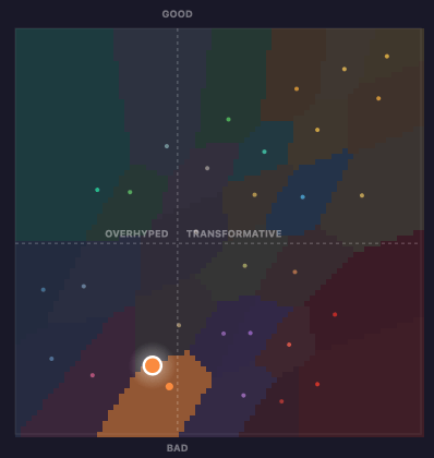
This “AI Compass” test was interesting. As with most such tests, it’s not perfect, and I have some quibbles with some of the questions and answers, particularly some where I think it falls into the usual trap of using “AI” for everything, and not adequately distinguishing between genAI and machine learning (ML), but still, not bad.
My result:
I’m the glowy orange dot. Looks like I’m right on the border, almost ending up classified as “The Skeptic” (full description below). (Side note: Pity about the poor and very inaccessible color design.)
YOU ARE… The Union Organizer
patron saint: Cory Doctorow.
AI is a real tool being used to extract real labor value from real people without paying them. You don’t care about the singularity — you care about the artists, writers, and workers getting strip-mined by capital. You’re not anti-technology. You’re anti-theft.
Looking at the full list of possible outcomes, I’d self-identify as one of the following. I think it’s my hedging slightly on some of the answers because of the genAI/ML confusion that pushed me into the result I got. They’re all in the same general “don’t like it, don’t trust it, don’t want it” quadrant, though.
The Luddite (Affectionate)
patron saint: Emily Bender
It doesn’t work the way they claim, it’s making everything worse, and you’d like your internet back, please. You can explain in precise technical detail why it’s a stochastic parrot, and you will, whether or not anyone asked. You’re funnier about this than people give you credit for.
The Digital Hermit
patron saint: Jaron Lanier
You’ve been saying the framing is wrong since before most people had heard of any of this. AI is less a technology than a story Silicon Valley tells to consolidate power, and the story is bad. You read physical books and you don’t need a language model to tell you what they mean.
The Skeptic
patron saint: Ed Zitron
It’s oversold, it’s losing staggering amounts of money, and the harms are arriving faster than the value. You’ve done the math on the unit economics and it doesn’t close. You are loud about this, prolific about this, and you suspect history will vindicate you.
⭐️⭐️⭐️⭐️: Descendants of Khan and his compatriots face off against the Federation. I found this one to be above average, with much of it being something of an early take on the same issues explored by Strange New Worlds with Number One’s status as an Illyrian in hiding, expanded to explore how a society of genetically engineered humans might deal with how they’d be perceived by the Federation. As often happens with any eugenics storyline, it would be improved if the Federation was more honest and introspective about how initial fear and caution has developed into long-standing systemic bigotry, but as Star Trek has yet to really tackle that aspect of the universe, I wouldn’t really have expected it from a thirty-year-old novel.
⭐️⭐️⭐️⭐️⭐️: Conservative techbros clone America’s founding fathers and raise them in isolation as if it were the 18th century, training them to bring America back to its former glory…until one of them finds a stray iPhone. A very funny and incisive sci-fi political satire; highly recommended.
⭐️⭐️⭐️⭐️: Hard-boiled noir detective fiction set in an alternate present where Sitka, Alaska is home to resettled Jews after Israel failed to become its own nation after WWII. In addition to being a fun and incredibly well-written noir, the Alaskan setting is great. I grew up in Alaska, and though I pretty much stayed in Anchorage and have only been to Sitka once on a cruise long after I’d moved south, Chabon’s descriptions of Alaskan locales, weather, and people feel oh so familiar. At least the secular bits; as a lapsed Episcopalian, I can’t speak to the Jewishness of it all. Excellent book.
Book 24 of 2026: Possession by J.M. Dillard and Kathleen O’Malley.
⭐️⭐️⭐️: A horror-ish entry, as malevolent alien entities possess the crew. A little slow to start, but not bad, with some nice moments focusing on Worf’s home life with Alexander.
⭐️⭐️⭐️⭐️: Okay, yes — it could be argued that this book is simply reinforcing my existing biases. But it does a damn good job of that! For anyone less than enthusiastic about the AI invasion, and for some who are too enthusiastic but could perhaps be convinced to question their stance, this is an excellent and accessible takedown of the overhyped and existentially problematic push for “AI”.
I only had two issues:
One, that the this area is simply moving so fast that even though the book was just published within the past year (and so written probably mostly in 2024, so even the most current research available while writing would have been from 2023 or 2024), parts of it already feel out of date. Of particular note to me as someone working in education was the “Listen Up, Class” section (in chapter 4, starting on page 93), which begins with a couple paragraphs citing 2023 research claiming that ChatGPT hadn’t made many inroads into student cheating. In 2026 — anecdotally, at least, from what I see and hear about at the college where I work — that is definitely not the current state of things. Students submitting content created by ChatGPT and other genAI systems is a constant battle that teachers are trying to fight and causing serious problems in nearly, if not entirely, every academic department.
Two, that for some reason (apparently a publisher’s requirement, according to a LinkedIn post from Ms. Bender I found), none of the copious endnote references are numbered in the text. The endnotes include notes so that they can be connected back to the main text, but it’s a very odd choice for the publisher to have made. If, as suspected, this was done to make the book more accessible to a mass audience, I kind of wish there was a second edition available for readers not turned off by footnote/endnote notations.